For some time now I have been using Photographer's Formulary Palladium print materials. I love the warm tones and rich details it gives. Sometimes the "dmax" isn't what I'm used to in original silver based prints. Overall, though, the Palladium processes have opened up my print making along new vectors of art.
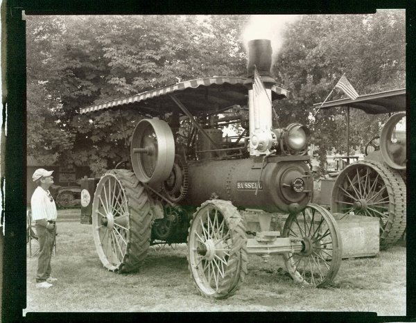
To compare original alternative print techniques against new digital tones I took two images and sliced them into three parts. The "lower" section would remain the original scanned Palladium tint, the "middle" section would take on a "platinum" tint selected from the GimpGuru, the "upper" section would take the "Bronze Quadtone" tint from Ken Lee's experiments on the topic.
The image of the old steam powered tractor is very instructional. The differences between the three tints are very clear. This leads me to think that digital tints might not duplicate the original Platinum or Palladium print tones.
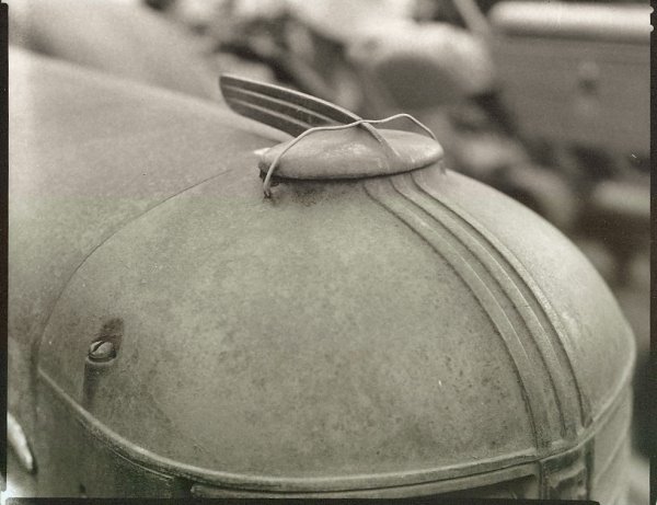
The image of the old tractor hood is also very instructional. There are practically no differences between the original Palladium tones and the GimpGuru "platinum" colors. Ken Lee's QuadTone tints remain quite different. This exercise now leads me to believe that original alternative print tones may be duplicated in digital. I also learned that there are significant variations in original alternative print tones between prints. While intellectually I "knew" this. "Seeing" the effect first hand was a little startling.
No comments:
Post a Comment